TL;DR
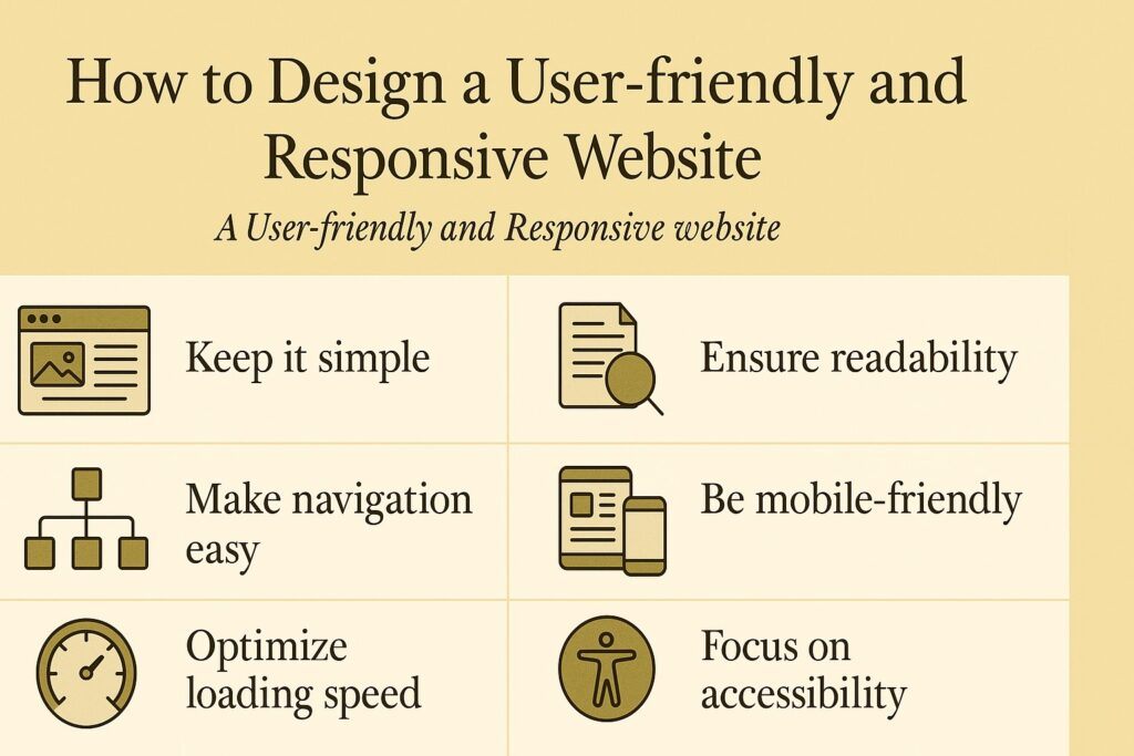
A user-friendly and responsive website adapts to any device, loads quickly, is easy to navigate, and presents content clearly. You can create one by using responsive layouts, optimizing content, improving navigation, enhancing performance, and testing your site on multiple devices. These steps improve user experience, boost search rankings, and increase conversions.
FAQs
What is a responsive website?
A responsive website automatically adapts its layout to different screen sizes such as desktops, tablets, and smartphones.
Why is user-friendliness important?
User-friendly design improves satisfaction, reduces frustration, and increases the likelihood that visitors will stay longer and take action.
Do I need coding skills to build a responsive site?
Not always. Responsive frameworks like Bootstrap or templates from platforms such as WordPress can help non-coders create responsive layouts.
How can I test if my site is responsive?
Use browser developer tools, online responsiveness checkers, or test on actual devices.
Does website speed affect SEO?
Yes. Faster websites rank higher on search engines and provide a better user experience.
Introduction
A user-friendly and responsive website is essential in today’s digital world. It ensures that your content is easy to view, navigate, and interact with on any device.
When your website adapts smoothly to different screen sizes, visitors feel more comfortable exploring your pages, reading your content, and trusting your brand.
A responsive and user-centered design improves user satisfaction, increases conversions, supports accessibility, and strengthens your website’s overall performance.
In this guide, you will learn the key principles and practical tips for designing a user-friendly and responsive website that serves your audience effectively.
Tip 1: Use a Responsive Layout
A responsive layout ensures your site adjusts its structure based on the device being used. This prevents elements from breaking or appearing too small on mobile screens.
To create a responsive layout, consider the following tools and techniques:
Media queries
CSS rules that apply different styles depending on screen width or orientation.
Flexible grids
Layouts using relative units such as percentages or ems instead of fixed pixel widths.
Fluid images
Images that scale proportionally to fit different screen sizes without losing clarity.
Responsive frameworks
Libraries such as Bootstrap, Foundation, and Materialize help you build responsive websites quickly with pre-designed components.
A responsive layout improves accessibility, prevents layout issues, and creates a smoother browsing experience for all users.
Tip 2: Optimize Your Content
Your website content must be readable, clear, and helpful. Optimized content keeps users engaged and reduces frustration.
Follow these best practices:
Use clear and concise language
Communicate your message simply and effectively.
Use headings and subheadings
Break content into scannable sections so users can find information quickly.
Use bullet points and lists
Present information in an organized way that is easy to digest.
Use images and videos
Visuals help explain ideas, attract attention, and make your site more appealing.
Use white space
Give your content room to breathe so users do not feel overwhelmed.
Clear, structured content strengthens usability and improves comprehension.
You might also like: Essential Computer Skills for the 21st Century: From Basics to Advanced Tips
Tip 3: Improve Your Navigation
Navigation guides your visitors through your site. If it is confusing, users will leave quickly.
Improve your navigation using the following steps:
Use a consistent and intuitive navigation menu
Place your menu in a familiar location such as the top of the page. Include essential categories such as Home, About, Services, and Contact.
Use a responsive and collapsible menu
Mobile-friendly menus such as hamburger icons save space and keep navigation clean.
Use breadcrumbs
Breadcrumbs show users where they are on your website and help them move back through pages easily.
Use a search box
A visible search bar helps visitors find information quickly, especially on large websites.
Good navigation reduces frustration, increases engagement, and helps users reach the content they want.
Tip 4: Enhance Your Website Performance
Website performance affects user experience and SEO. A slow site leads to high bounce rates and lower conversions.
Improve performance by applying the following methods:
Optimize images and videos
Compress media files without losing quality so pages load faster.
Minify your code
Remove unnecessary characters or spaces in HTML, CSS, and JavaScript files to reduce file size.
Use caching
Store frequently accessed files so they load faster for returning visitors.
Use compression
Gzip and other compression tools shrink file sizes to speed up loading.
A fast website feels more professional and keeps visitors on your site longer.
Tip 5: Test and Evaluate Your Website
Testing your website ensures it works as expected across all devices and browsers.
Use these methods to evaluate your site:
Browser testing
Check compatibility on edge browsers like Chrome, Firefox, Safari, and Edge.
Device testing
Test your site on desktops, laptops, tablets, and smartphones to confirm responsiveness.
User testing
Observe how real users interact with your site. Collect feedback through surveys, interviews, or recorded sessions.
Testing reveals design flaws, usability issues, and areas for improvement.
Examples of User-friendly and Responsive Websites
Here are strong examples you can learn from:
Airbnb
Simple navigation, strong visuals, flexible search features, responsive layout, and excellent performance.
Spotify
Clean design, adaptive layout, intuitive navigation, and engaging visual elements.
Netflix
Clear content structure, fluid responsiveness, fast loading times, and consistent user experience across all devices.
These websites succeed because they balance design, performance, and usability.
Conclusion
Designing a user-friendly and responsive website is essential for today’s digital audience.
By using a responsive layout, optimizing content, improving navigation, enhancing performance, and testing your site regularly, you create a better user experience and a stronger online presence.
These strategies help you build trust, increase engagement, and support long-term growth in your digital projects.
If you would like to know more about my path as a writer, including the struggles, lessons, and small signs of progress along the way, you can read the full story on my Wealthy Affiliate blog here: https://my.wealthyaffiliate.com/johnmaluth/blog